Washington’s pro football team has a new name, of course, and so the new team now has a new uniform, too. Well, it’s an old uniform with a few tweaks really, making a brand new design feel wonderfully old fashioned. Confused?
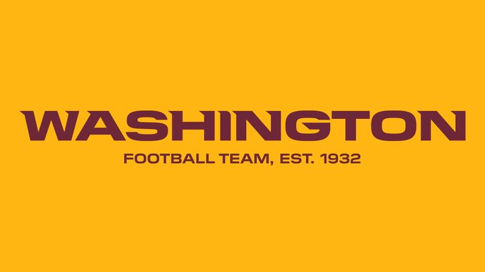
The Native American silhouetted head is gone, replace by a stylised ‘W’. After all, the Washington Football Team, capitalized, isn’t really a name that lends itself to a cool new logo. A college-type ‘W’ works here – at least in lieu of, say, an arrow or a single feather. I hope it’s okay to say this without offending anyone. I mean in all likelihood someone out there is upset by the use of a sole W. Always hard to get a read on this.
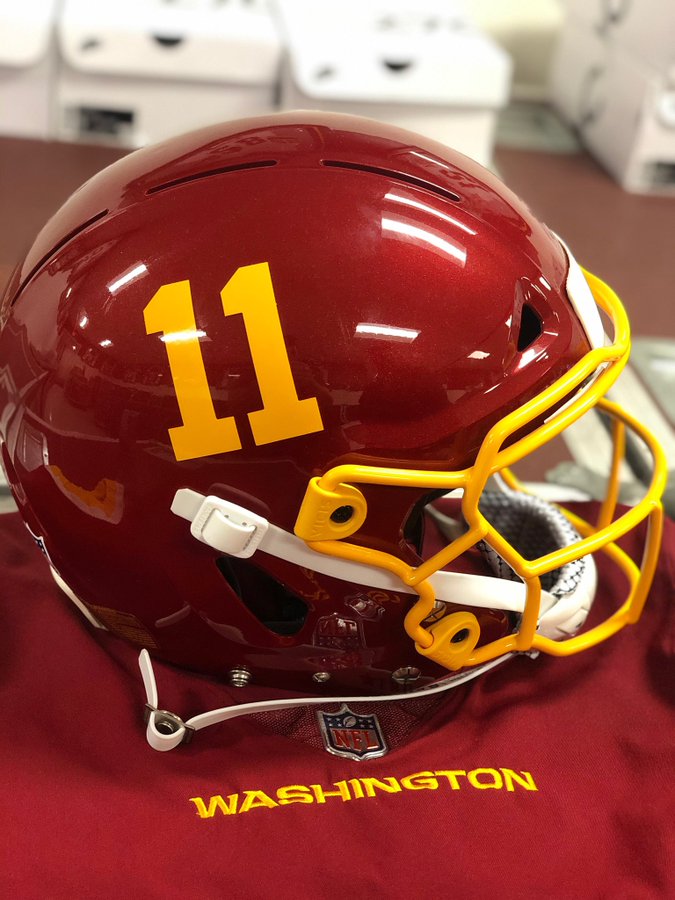
Anyway, the club’s marketing people who had the unenviable task of reinventing an 80-something-year-old club, were forced to jump in a time machine. It may very well have been Doc Brown’s Delorean, especially when you consider the Doc’s yellow and red outfit in the Back To The Future sequel. Was he a Washington fan? That’s for another post. Only by pretending it was 1922 – or better yet 1932, the year the club was inaugurated – could these brave marketeers conjure an idea worthy of 2020’s lofty social ideals, and all without disrupting the space-time continuum. What did they come up with? Well a remarkably attractive burgundy helmet with yellowy gold numbers. I’d take this look over a modern-era logo any day.